After my Mi Band 2 review, I came to the conclusion that Android Wear cannot justify its price tag. I’m referring specifically to LG Urbane, which, as nice as it was back then at £279, falls short compared with a sports tracker you can get for less than 10% of that. With that said Mi Band 2 wasn’t perfect, and I really hoped that the new iteration of the product will fix all the imperfections. This is the Xiaomi Mi Band 3 review.
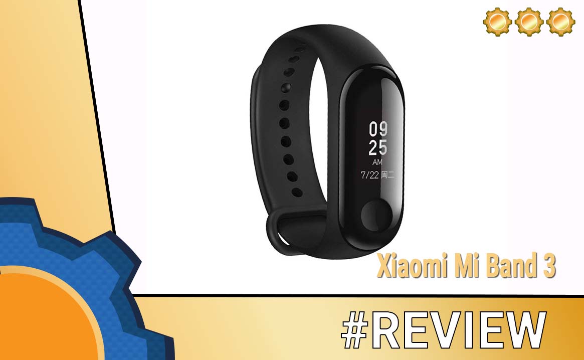
Xiaomi Mi Band 3

I have two Xiaomi Mi Band 3. One is wrapped around my wrist, the other one is measuring Kathy’s (spouse) vitals. I got both of them at the same time. One as a gift for my better half as she is very bad at taking breaks at work, the other one has been sent to me by Banggood.

It was a small risk to take, as I was already in love with the Mi Band 2 and the Xiaomi Mi Band 3 just takes things to the next level. The sports tracker is bigger, there is an additional 1cm your wrist has to accommodate for. This is not a problem for me, but I have to say on Kathy’s wrists it does look ridiculously big.
It’s an important note, as you won’t be able to use Mi Band 2 accessories, however, you can still charge the old Mi Band with the new cable (not the other way around).
With a greater size, comes a greater screen. The display is capable of accommodating 6 lines of text at once. It’s a big step up in terms of the information available on the band. It’s a shame that the screen’s brightness is not ideal for sunny days. Looking up notifications in the direct sunlight takes some wrist adjustments. I’m in the UK, it will literally bother me about 3 times a year, so I’m ok with it!
The Xiaomi Mi Band 3 can be taken diving as long as you don’t go under 50m, has touch controls (button and swipes) and it has a nicer in touch glass finish. The rubber band seems to be little thinner but causes havoc when I’m trying to remove the Xiaomi Mi Band 3 for charging. I hope the rubber stretches out a bit as currently, it’s an operation that requires strength.
New features – Xiaomi Mi Band 3

Out of the box, Xiaomi Mi Band 3 comes with new menu options. There is a weather tab, a dedicated notification section, smart tracker faces, timer and options to find your phone and silence the notifications. The majority of the operations are done by swipes (up/down, left/right) and long/short taps to cancel or enter menus. It’s quicker than the one-button operation of the Mi Band 2, but not error-free. I happen to swipe left a few times when trying to swipe up.
Are the notifications any good now?

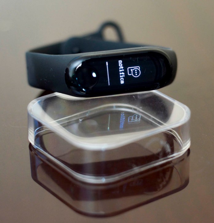
I’m pleased to announce that notifications are no longer rubbish. I have about 10 sec to access the latest 5 notification on the Xiaomi Mi Band 3, half of this with the display on. Should I miss any of them, I can access all the notifications from the menu too. The biggest flaw of the previous model has been addressed!
While speaking of notifications, you can nudge your friends on Mi-Fit app. Something I only discovered now. It’s brilliant as the nudged person will receive the notification on their bracelet. A perfect way to let the loved ones know you think of them. I’d love a shortcut on your bracelet too, but for now – I have to go into the app.
Tell me the weather

The sports tracker comes with 3-day information about the local weather. It’s a nice addition, however, I miss the daily breakdown. If you want to plan a run or cycle, it would be good to see if it’s going to rain today. It may not bother you if you live in the country with a stable weather, but here in the UK, weather changes 24 times a day.
Steps Calories and Heart Rate Monitor

This is mostly unchanged compared to the Mi Band 2. The battery notification has moved to a submenu of steps (personally, I’d look for it in the “More” section). During my tests, I found the steps and distance (pulled from the phone location services) to be accurate. The heart rate monitor result depends on where the Mi Band is and how tight it is wrapped around the wrist. The best results I had when the sensor was placed on the under-side of my wrist. This is true for other wrist devices and the accuracy can suffer. With that said all results were within few beats of Mi Band 2 and LG Urbane and it takes anything up to 12 seconds to display it.
I love the automatic heart rate monitoring, which increases the frequency of the tests during sports activities.
“More”

There are a couple of more features, 3 Mi Band screen presets, a timer, an option to silent the notifications and find your phone. It’s a good selection of features.
Battery
Coming from the 2-day battery life of an LG Urbane to 12-20 days of Mi Band 2 – I’m pleased to say Xiaomi Mi Band 3 is on pair with an excellent battery life of its predecessor. I was able to get about 12 days using the most power hungry heart monitoring options and tonnes of notifications. If you willing to give up on these – I’m sure you could extend the tracker life beyond 20 days.
The Mi-Fit app
There are very little changes in the app itself. The same data is available from Mi Band 2 and 3 on your app. The app is well designed and provides you with sleep, steps, weight, heart rate charts.
These can be compared to other users of Mi-Fit, giving you an idea – how active is your life. The sleep tracking can be hit or miss if you work nights, as the app does not account for the grave shift workers like me.
All of the Mi Band 3 settings are available through the app, and this is where you can set the tracker preferences, notifications and other settings. If you used the app with other Xiaomi’s products you will feel right home.
Conclusion
If you don’t have a sports tracker or an Android Wear device, you will be very pleased with the price to performance ratio. The Xiaomi Mi Band 3 fixes what have been missing on the previous band, while keeping the price similar. I’m hoping for some software updates that will let you customise the tracker even more, and perhaps a small overhaul of the notifications as for now, while very useful, they seem little cluttered.


